Kanban Board
What is the Board component
A board (also known as Kanban Board) is a visual tool that gives an overview of the current status of entities being tracked.
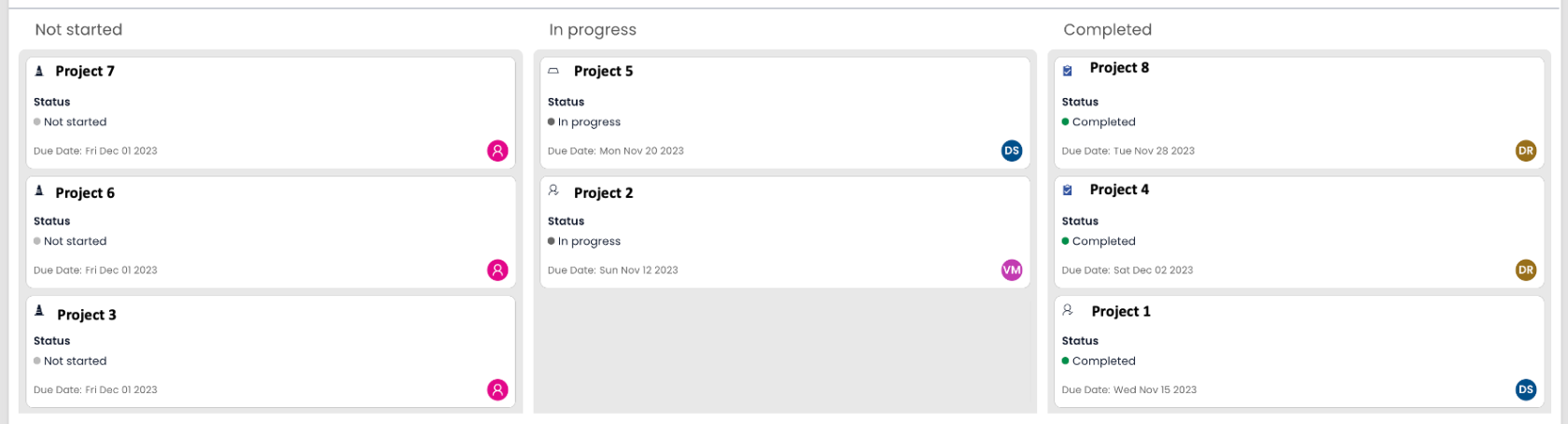
Imagine a CEO of a technology company wants to have a snapshot of current status of various projects in the organisation. These projects should display information on the names of the Project Managers and respective Due Dates. Moreover, as needed, the CEO should be able to drag and drop projects across categories to update status.
The board component can provide a convenient view of projects organised across status categories. In the below image Not started, In progress and Completed are the Project Status on which Project Titles are categorised.
There can be many other use cases like - a sales manager viewing the status of various leads, a purchase manager looking at items' order status, an accounts manager monitoring invoices status etc.
Board component can only be set up for a table that has the following:
- A title field - like project name
- A choice type field - like project status
- A user type field - like project manager
- A date type field - like project due date
If any of the above types are missing, then the Board component cannot be configured properly.
How to set up Board component in Designer
-
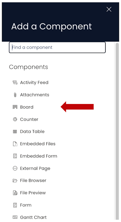
You can add the Board component on to the Layout / Page. The Board component is not present anywhere by default.
-
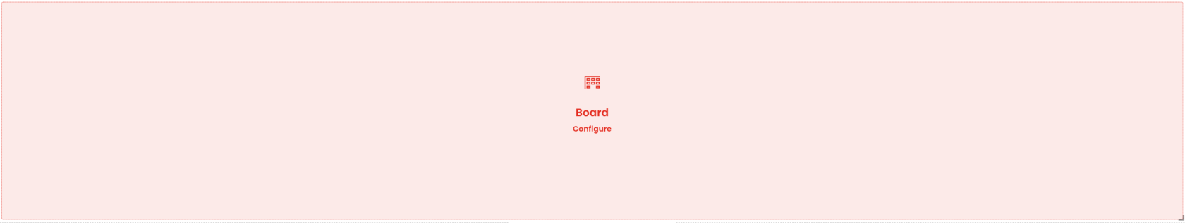
As the Board component is added to the layout / page, it needs to be configured. A Board component which has missing configuration appears RED. It provides a configure button which opens the Edit panel (described below).
-
If the Board component is on a Grid Layout, you can resize and move the component over the layout.
-
You can set the visibility of Board on the Details breakpoint.
-
You can set the **visibility of Board on the Create Screen breakpoint.
-
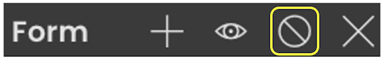
You can configure the Board component by clicking on the Edit (pencil) icon.
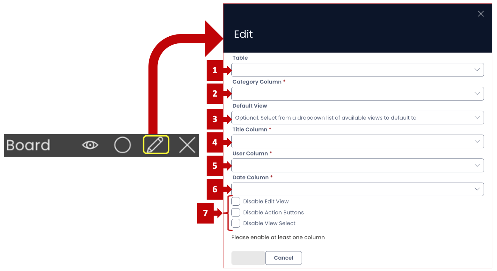
Following is the brief description of each field:
-
Table - This is a dropdown field. You can select your desired table from the list of available tables in the system. Please note, this is not a mandatory field. If a table is not selected here, then the system will take the default value as the table on whose Design Tab you are hosting the subject Page.
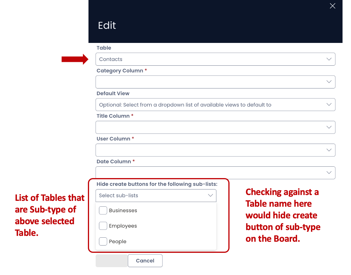
- In case there are sub-types of the selected table, then they will appear in a list as shown below. There is a checkbox next to each sub-type table title. If you check a box, then the system will hide the Create New Item button from the Board for that sub-type.
For example - if the Table selected is "Contacts". Businesses, Employees and People are sub-type of Contacts table. Now (by default) the Board component will enable the user to create new items for Businesses, Employees and People contacts tables. If a box is checked for Businesses, then the button to create new item for Businesses contacts will be hidden and the user will not be able to create new items from the Board component for relevant sub-type table.
-
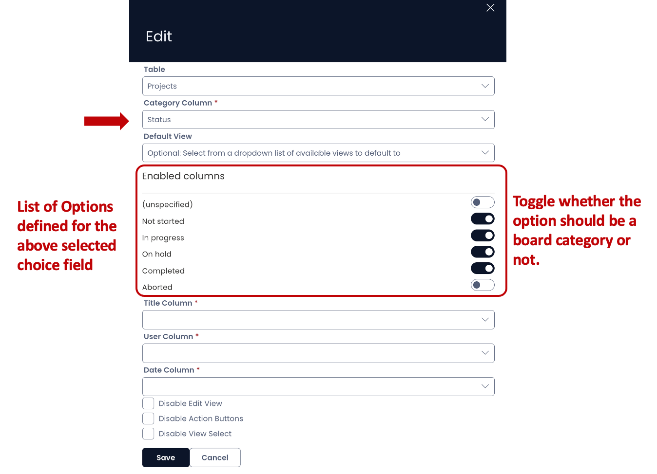
Category column - This is a mandatory field. The dropdown will display a list of all Choice Type fields present in the select Table's structure. Based on the selected Choice type field, the categories for the Board component will be displayed. This means, all the relevant items will be categorised across the relevant options of the choice field.
In case, no table is selected, the choice type fields of the table on whose page you are setting up the Board Component, will be displayed.
Note, in the image above, the Save button is not visible. This is because Category Column is blank in it. Once the Category column field has a value, the Save button appears.
- Just as you select a Category Column, the options of the choice type field will appear in a section (Enabled columns) as shown below. For example - if you have selected a choice field - "Status" for the table Projects, and this field has five options as - Not started, In progress, On hold, Completed and Aborted. Now the Enabled columns section in Board configuration will show six fields - five configured and one as (unspecified). The unspecified option refers to those items where the Status field is blank.
Further, each option has a toggle button against it. Please note, by default, all the options are in ON state. If the button is ON, it means that the subject option will become a category for Board component. If the button is in OFF state, it means that the subject option will not become a category for Board component. All the items with such a value for the Status will not appear.
For instance, observing the below image, we can say that the corresponding Board will have four categories. All the items with unspecified and Aborted Status values will not feature on the Board.
-
Default view - This is an optional field. This dropdown field will display a set of all configured Table Views based on which the items will be filtered / sorted. The selected value for Default view field here will define the default view to load for the Board component.
-
Title column - This is a mandatory field. This forms the title of the Board items. For example - Project Name.
Please note, this is a dropdown field. The dropdown will provide a list of all columns from the selected Table's structure but not all types feature in this list.
Can be a Title Cannot be a Title Single line of text Multi-lines of text Email Date and Time Choice Lookup Number Boolean Percentage Users Currency Multi-Lookup Computed PowerBI Report Subquery Whole Number -
User column - This is a mandatory field. In this dropdown, you will find all the User Type column names for the selected Table. The User value appears as a small coloured circle with initials of the User in the Item. For example - Project Manager for a Project is selected in User Column. Let the name of the "Project Manager" for a Project be "Mary Jane". Then "MJ" will appear in a coloured circle at the bottom right corner of the Board Item (refer the first image of this article). In case the Item does not have a value to the selected User Type field, then a human icon will appear.
-
Date column - This is a mandatory field. In this dropdown, you will find all the Date and Time Type columns for the selected Table. The value of Date column appears on the Board Item. For example - "Project Due Date" can be selected as a Date Column.
-
Section to Disable Edit View, Action Buttons and View select - This section has three checkbox fields. Just like any Data Table component in Explorer, you can Edit Table View, press Action Buttons in the Command Bar Menu and Select / change Table View.
Selecting the checkbox will hide the respective button from the Board component and thus, the user cannot perform the subject action.
-
Once the Board Component is properly configured, it will no longer appear RED. It show the name of the Target Table (selected in 1. Table field above) on which the Board component is created.

-
You can set up a Board component on an Individual Item (Singular) Level as well as Group Item List (Plural) Level.